Did you know that Cerebral Palsy (CP) doesn’t actually have a universally recognised symbol?
Yep, that’s right! Unlike autism’s puzzle piece, with some people using the rainbow infinity symbol, or the ADHD rainbow butterfly, CP doesn’t have that one go-to image that everyone recognises at a glance. And honestly? That’s a bit surprising for a condition that affects so many people worldwide!
Now, before you start picturing some kind of secret society, let me explain. CP is a hugely diverse condition. No two people experience it the same way, so perhaps it makes sense that it hasn’t been boxed into a single image. But as a mum in the SEND world, I know how powerful visual symbols can be in raising awareness and making our kids feel seen.
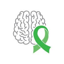
So, what did I decide to go with? Well, the green ribbon has long been associated with CP awareness, and it’s a great start. Green symbolises hope, renewal, and resilience—qualities that perfectly describe our incredible children! But let’s be honest, as lovely as ribbons are, they’re not exactly an instant visual cue like a wheelchair symbol or a sunflower lanyard.
That’s why I decided to choose a more visually representative image that truly captures CP while keeping the green ribbon’s powerful meaning. Because let’s face it, symbols matter. They create recognition, spark conversations, and—most importantly—help our kids feel part of something bigger.
So, what do you think? Should we rally for an official CP symbol? Maybe we should design one ourselves—something bold, beautiful, and unmistakably CP! One thing’s for sure: our children deserve to be seen, recognised, and celebrated.
Let’s keep the conversation going—what would your ideal CP symbol look like?
Drop your ideas below!